Advanced Typography / Task 3:Type Exploration and Application
12/06/2024 - 22/07/2024 Week8 - Week14
ID name YANG HANWEN
ID number 0364085
Program name bachelor of design (honors) in creative media
Task 3:Type Exploration and Application
LIST
▫ Lectures
▫ Feedback
Lectures
Instructions
Task 3:Type
Exploration and Application
For this assignment we are free to come up with our own project. We are
required to research the use of fonts in our field of interest or develop
a font to address the challenges in that field. The final product will be
a developed font for use in whatever media is relevant to the problem
being solved.
*The above are all copied and pasted based on
the e-portfolio case given
in
this ↓ instruction😑.(This is basically what is done
here)

Task 3_ Typeface Options,By YANG HANWEN
In the 11th week class, Mr. Vinod Nair looked at my
PPT
and asked me to continue using the font I submitted in
Task 2
as the output font for
Task 3.

Typeface Process:
Based on
the tutorials in the first semester typography module, I re-watched the two video tutorials:
Typo Task 3A Typeface Construction (Shapes)
and
Typo Task 3A Typeface Construction (Strokes + Brush).
*Okay, I admit that I did forget the previous process😑.


First, I made
the capital letters in Adobe Illustrator.


As for
the punctuation marks, I didn't know which ones to make, so I just used all the punctuation
marks on the keyboard.

As a result, an embarrassing thing happened:
the font
I was aiming at was Microsoft YaHei Bold, but
the Microsoft YaHei font of the Windows system is not synchronized
with the Microsoft YaHei font of MacOS.

|
|
The original design to be exported |

Therefore,
the design before receiving feedback
is as shown below↓.


He said yes.


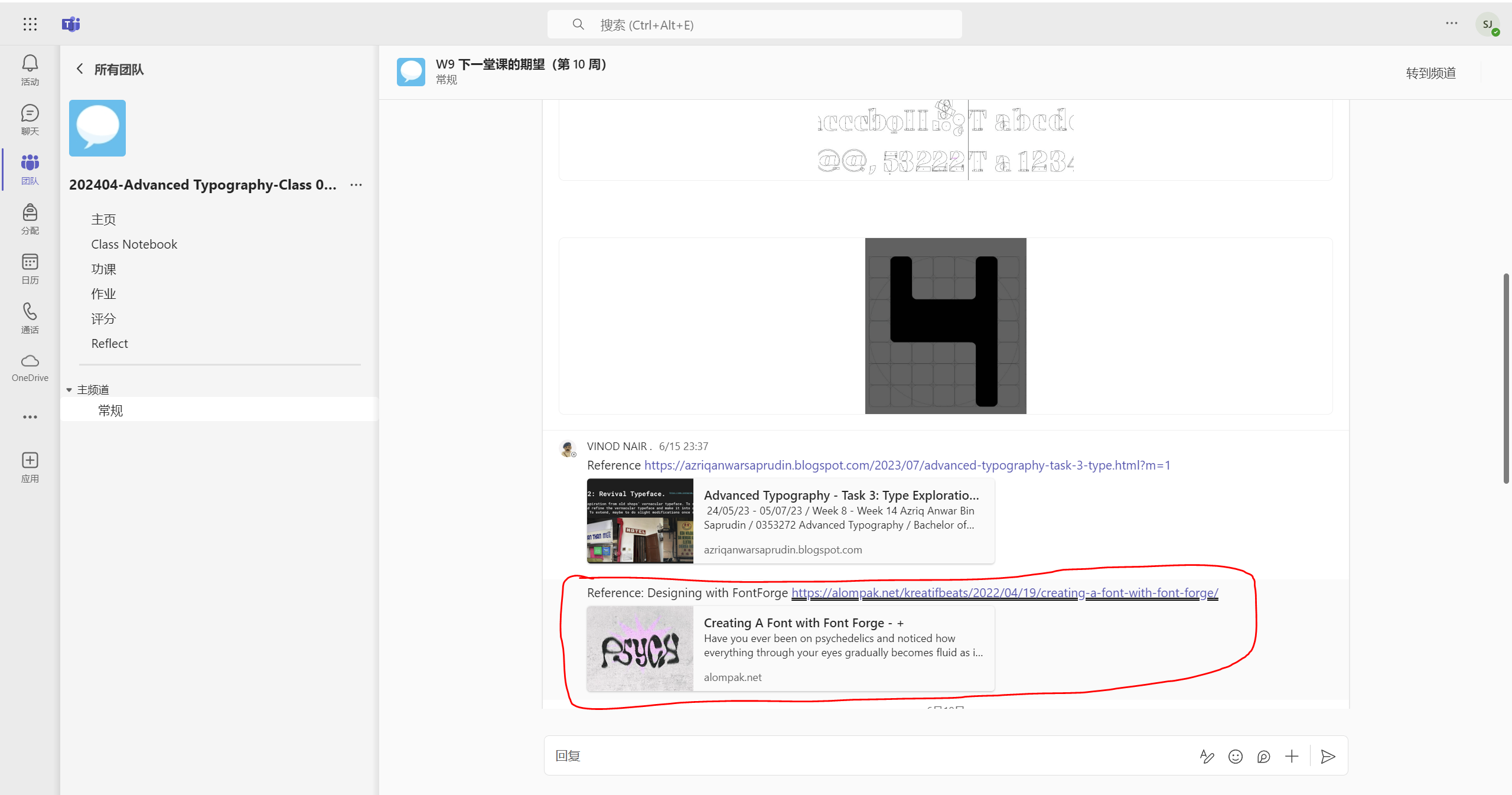
Here’↓s workflow after receiving feedback from the offline class on July 10,
2024.
First, after he looked at my Adobe Illustrator project file, he pointed
out that the letter "M" and the letter "W" I made were in the reverse
position.


He showed me his MacBook and showed me how to change some letters and
suggested some changes...
Then he sent me the Adobe Illustrator project file after his
modification↓.

|
| The part in the red box is the part that was edited for me (if I remember correctly) |
Based on VINOD NAIR's suggestions, I modified or redid these
designs.

Then I aligned and added the following two symbols:~、


Since I used
a trial version of FontLab7
in
Task 3 of the 1st semester of typography,

So I chose to use another software
from Mr. VINOD NAIR in the Advanced Typography Channel of the
Microsoft Team:
FontForge.

Then I followed this tutorial to generate the font...


The same problem occurs in the part including the symbol.

So what I did was
to put these uppercase letters and lowercase letters together into the
"Resource Export" box in Adobe Illustrator;


Put the symbol part and the number into the "Resource Export" box...

Then export together.
Put the newly exported SVG file into FontForge and ...


remove the uppercase letters, leaving only the lowercase letters.
The symbol part is to remove the number part and only leave the
symbol.


Good. It looks much better now.


So this is all the fonts I generated.

Finally, I adjusted the spacing of the "/space".


- The Process of Font Presentations & Font Applications(Before Feedback)

The following are examples given by Mr. VINOD NAIR in Microsoft
Teams.

|
| Complete font presentations (5 artworks; 1024 x 1024 px, 300ppi) |

|
|
Complete font applications (5 artworks simulated; size subject to application but should not exceed 1024px in width or height. 300ppi) |
Based on ↑ the examples he gave, I made these ↓ design drafts "quickly" (meaning it took me at least 6 hours).


|
| *Ah, this is a screenshot of the new material project after I downloaded the pin image and imported it into PS for cutting |
In the offline course of advanced typography on July 15, 2024, Mr.
VINOD NAIR said to me, "The materials for font applications need to
start from the objects around you, such as your shirt, your hat,
your mobile phone, etc." Then I asked how the 5 font presentations
above were done, and he said "Fine".
X4BFI_%5DWV6%5DTAJFJ.png)
- The Process of Font Applications(After Feedback)
I took
these photos
and...
D%5BB%601%7B25EYE_P$TZX.png)


|
| *Haha, this is my group assignment for my social innovation project |
chose these ↑ 5 photos as the ones I used for font
applications.
So here ↓ are the screenshots of my project process in Adobe
Illustrator & Adobe Photoshop.


According to
the ↓ instructions of Mr. VINOD NAIR in the Microsoft team, my submission should be as ...

Final Submission:
Complete font presentations (5 artworks; 1024 x 1024 px, 300ppi).
- A-Z; Numerals; Punctuation

Typeface Presentation 1 
Typeface Presentation 2 
Typeface Presentation 3 
Typeface Presentation 4 
Typeface Presentation 5 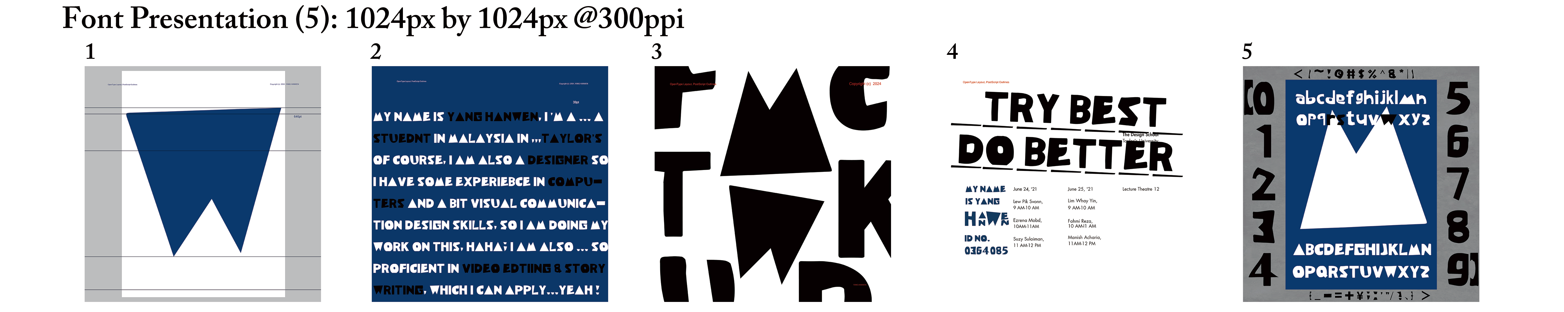
*Font Presentation (5):1024px by 1024px @300ppi -
Designed font link to your .ttf font.
Link to TTF font file: https://drive.google.com/file/d/1CX68HP4DeBve84jUQw8eY3sYSfGXNfoQ/view?usp=sharing
- Font preview (optional)


 | ||||||
1. Font Application on IC Card
|


- PDF
Feedback
Week 9 (17/06/2024):
General feedback:
I haven't asked Mr. VINOD NAIR for feedback yet. I will watch the
recorded session
first and then decide what to do for Task 3.
Specific feedback:
[Task 3 presentation] Prepare a final Task 3 presentation (Google Slides/PPT) – explain the intent of the design, show examples and experiments.
Week 10 (24/06/2024):
General feedback:
An ironic thing is that I just finished writing the
PPT
that needed to be checked by Mr. Vinod Nair before the 11th week,
including this feedback, a few hours before the 11th week of
class. I hope he will check my PPT and give me feedback for the
11th week.
Specific feedback:
[Complete all Uppercase letterforms]Task 3: Fill out at least all capital letter forms (once design is approved) Use a grid to ensure consistency in weight (stroke thickness).
Week 11 (01/07/2024):
General feedback:
Mr. VINOD NAIR approved the font I made based on the final submission of Task 2 as the design for Task 3, so I can start to expand my letterforms.
Specific feedback:
[Note] When importing letter forms from Adobe Illustrator, be careful Do not "Round", click on "Keep"& Ensure to set preferences ("keep strokes and colours... and Ai import original position...", see attached scree grab).
Week 12 (08/07/2024):
General feedback:
I checked the font I designed with Mr. VINOD
NAIR. After checking it, he asked me to
send my Adobe Illustrator project file in
Microsoft Teams
and
helped me make some modifications, allowing me to change/redesign it based on
his modifications. After I changed some
problematic fonts, he finally approved me for
font generation.
Specific feedback:
[FGDA] That is, font generation (using FontLab7 or FontForge to generate fonts), demonstration (using the generated fonts to complete five simulated artworks) and application (5 artworks simulated; size subject to application but should not exceed 1024px in width or height. 300ppi).
Week 13 (15/07/2024):
General feedback:
There is no problem with font generations
and font presentations. The materials that
need to be pasted on the font application
should come from the things you carry with
you in your life (such as personal own
clothes, hats, mobile phone cases, etc.)
—— Mr. VINOD NAIR.
Specific feedback:
[Final Compilation & Reflection] Complete and submit the e-portfolio for Task 3 and prepare the final compilation and reflection.
Week 14 (22/07/2024):
General feedback:
Good news: "You're done." by Mr. VINOD NAIR.
Bad news: My OCD is acting up💀 (because I was half an hour late).
Specific feedback:
[Consummation] Tasks 1, 2, 3 and the final compilation and reflection have all been submitted and passed the inspection.
Reflection
Experience
The experience of this mission gave me a better understanding of typography. It taught me how to adapt. The most classic example is that when a software/platform cannot be used, we can choose other ones to replace it. To use the game "Genshin Impact" that I often play as an example, if this character is not obtained and the team is not complete, we can use other characters with similar functions to replace it at the same time or at a lower level.
Observation
According to my observation, in the process of completing my own design according to the tutorial, due to the changing times, the tutorial version we watched seems to be a little behind our current design tasks. Therefore, I think it is necessary to update or supplement the tutorial.
Findings
Tell a joke, I originally planned to make a set of Chinese (Simplified) characters after I finished the English fonts. But when I saw that I had to make so many characters in FontForge, I decisively chose to give up.

Further Reading
1."Lettering & Type"

Week 8 / 2024.06.10
Chapter 2 - System & Type-ologies
Chapter 2 - System & Type-ologies
The second chapter of the book further explores typographic systems,
such as grids and guides used to build new typefaces. Typefaces and
letter designs all originate from a concept, whether it is simple or
complex. The chapter also breaks down the structure of roman letters,
italics, and even different types of serif letters, as well as their
names.
Week 9 / 2024.06.17
Chapter 3 - Creating Letters
This chapter discusses all aspects of lettering from conception to drawing, including the planning and design process, the importance of letter structure and proportion, and how to optimize the design through multiple adjustments. The chapter also covers practicing strokes with a flat-tip pen, designing text letters and modular letters, dealing with the challenges of screen fonts, designing handwriting and cursive, casual letter styles, and methods for creating weathered effects. Finally, an interview with Ken Barber provides industry professional insights and experience.
Week 10 / 2024.06.24
Chapter 4 - Making Letters Work: Transforming Type
The Transforming Type section of this chapter discusses giving letters new personality and purpose by customizing and modifying existing typefaces, including rounding corners, adding decorations, hyphens, etc. to change the overall tone and feel of the typeface, and creating new or alternative characters to fill in the gaps of the typeface to meet specific design needs.
Week 11 / 2024.07.01
Chapter 4 - Making Letters Work: Lettering as Image
This section discusses the concept of letters as images in type design. The author states that the abstract nature of letters allows them to express emotion and information and function on both a textual and visual level. This approach challenges traditional typography, requiring the viewer to focus on the form and context of the letters. Historically, artists have enhanced meaning by deforming and redesigning letters, such as Arabic calligraphy and Gothic alphabets. These traditions influenced 20th century design movements that further blurred the line between text and image.
Week 12 - Week 14/ 2024.07.08 - 2024.07.22
Chapter 4 - Making Letters Work: Designing Typefaces
This chapter finally introduces the basics of font design, including design concepts, font family concepts, character structure and characteristics, and professional terminology explanations. It emphasizes that font design should be carried out around a clear intention and take into account the expected usage. It introduces the collaborative principles of different styles and weights of fonts within a font family, and discusses the importance of adjusting character spacing and word spacing to improve text readability and aesthetics. At the same time, detailed instructions on letter structure are provided to ensure the overall visual effect and usage experience of the font. In addition, the role of numbers and punctuation marks in font design is explained, and professional terminology definitions are provided.


Comments
Post a Comment