Advanced Typography / Task 2 : Key Artwork and Collateral
20/05/2024 - 12/06/2024 Week5 - Week8
ID name YANG HANWEN
ID number 0364085
Program name bachelor of design (honors) in creative media
Task 2 (A&B): Key Artwork and Collateral
LIST
▫ Lectures
▫ Feedback
Lectures
Week 5
Perception & Organisation
Perception is “the way in which something is regarded, understoodor interpreted".So, is perception what you see——and thereforeunderstand-or what you are manipulated into seeing and understanding?
Perception in typography deals with the visual navigation andinterpretation of the reader via contrast, form and organisation of thecontent. Content can be textual, visual, graphical or in the form ofcolour.However our focus today is in typography.
So how does contrast work? And what does form entail?
- Contrast
Dair posits 7 kinds of contrast (most of which has already beencovered by Rudi Reugg albeit using different terms): 1. Size, 2.weight, 3. contrast ofform, 4.contrast ofstructure, 5. contrast oftexture, 6. contrast ofcolour and 7. contrast of direction.


Let us look at Dair's explanation of these.
- Contrast / Size
A contrast of size provides a point to which the reader's attention isdrawn. For example if you have a big letter and a small letter you willobviously see the big letter first before the small. The most commonuse of size is in making a title or heading noticeably bigger than thebody text.
Source: Arletta, Abby, Kelly, Eunice, Wen Yi, Baahy, Ava, Jason, Sangeetha - Contrast / Weight
Weight describes how bold type can stand out in the middle of lightertype of the same style. Other than then using bold, using rules, spot, squares is also provide a "heavy area" for a powerful point of visualattraction or emphasis, therefore not only types of varying weight.

- Contrast / Form'
Contrast of form is the distinction between a capital letter and itslowercase equivalent, or a roman letter and its italic variant,condensed and expanded versions of typeface are also includedunder the contrast of form.

- Contrast / Structure
Structure means the different letterforms of different kinds oftypefaces. For example, a monoline sans serif and a traditional serifor an italic and a blackletter.

- Contrast / Texture
By putting together the contrasts of size, weight, form, and structure.and applying them to a block of text on a page, you come to thecontrast of texture. Texture refers to the way the lines of type look asa whole up close and from a distance. This depends partly on theletterforms themselves and partly on how they're arranged.

- Contrast / Direction
Contrast of direction is the opposition between vertical andhorizontal, and the angles in between. Turning one word on its sidecan have a dramatic effect on a layout. Text blocks also have theirvertical or horizontal aspects of direction. Mixing wide blocks of longlines with tall columns of short line can also create a contrast.

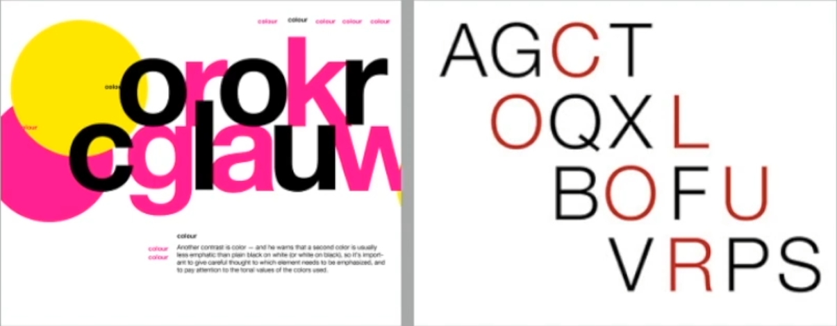
- Contrast / Colour
The use of color is suggested that a second color is often lessemphatic in values than plain black on white. Therefore it is importantto give thought to which element needs to be emphasized and to payattention to the tonal values of the colors that are used.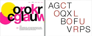


- Form
 |
| Source: Arletta, Abby, Kelly, Eunice, Wen Yi, Baahy, Ava, Jason, Sangeetha |
Originating from the Greek words “typos" (form) and “graphis(writing),typography means to write in accordance with form.Typography can be seen as having two functions:
- to represent a concept
- to do so in a visual form.

When a typeface is perceived as a form, it no longer reads as a letterbecause it has been manipulated by distortion, texture, enlargement.and has been extruded into a space.


- Organisation / Gestalt.
The Gestalt psychologists, especially Max Wertheimer, developed anumber of “laws" that predict how perceptual grouping occurs undera variety of circumstances (Wertheimer, 1923/1938).Technically, insciences, laws are predictions that are true. in reality, these laws arebetter classified as principles
Gestalt theory emphasizes that the whole of anything is greater thanits parts-this is based on the idea that we experience things asunified whole: Instead of breaking down thoughts and behavior totheir smallest elements, the gestalt psychologists believed that youmust look at the whole of experience.
Therefore in design (read: typographic layouts), the components/elements that make up the design is only as good as its overall visualform. While each component may be functional at an elemental level, the sum of its parts is not greater than the whole or the overall form.
- Organisation/Gestalt: Perceptual Organisation / Groupings
- Law of Similarity
- Law of Proximity
- Law of Closure
- Law of Continuation
- Law of Symetry
- Law of Simplicity (Praganz)
- ...
The Law of Proximity is the gestalt grouping law that states elementsthat are close together tend to be perceived as a unified group. Thisstraightforward law states that items close to each other tend to begrouped together, whereas items further apart are less likely to begrouped together.

The Law of Closure refers to the mind's tendency to see completefigures or forms even if a picture is incomplete, partially hidden byother objects, or if part of the information needed to make a completepicture in our minds is missing
Law of (Good) Continuation holds that humans tend to perceive eachof two or more objects as different, singular, and uninterrupted objecteven when they intersect. The alignment of the objects or forms playsa major role for this principle to take effect. For more.

Law of Praganz.
You can find out more about these laws by viewing the links providedor simply Googling them. However keep in mind that you will findvariation in the interpretation and you will have to weigh them all tocome to a consensus.of your own.
The idea in the end, is to ensure awareness and inform your workprocess.Organisation of information in the form of laying out complexcontent in a hierarchical manner requires practice and the knowledgegained herein but also elsewhere. Knowledge obtained from readinglistening and viewing must be exercised or put to use for it to beretained and of standard.

Instructions
Task 2A: Key Artwork
- Before Feedback
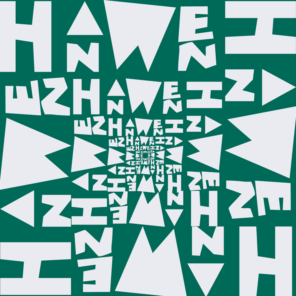
Because the font of this design needs to use my own name, and the Chinese pinyin of my Chinese name is "YANG HANWEN", I think the character length is a bit too long, so the following are the three ↓ characters I will use for my name...
 |
| "YANG HANWEN" or "HANWEN" or "YHW" |

Anyway, according to Mr. VINOD NAIR’s instructions on the afternoon of May 13th, he gave the following ↓ five pictures as a reference.
 |
| figure 1 |
 |
| figure 2 |
 |
| figure 3 |
 |
| figure 4 |
 |
| figure 5 |
Let’s look at figure 1 first. This design is very similar to the fonts in early 8-bit games. It’s a coincidence that I have seen this font, so I just looked for one here.

So the first reference, my parody export is as follows↓.


I looked at the two fonts above and directly downloaded and installed them in my Adobe Illustrator. Then I placed it as shown in the reference and it became like this↓


Then import it into Adobe Illustrator on Windows.


So the second reference looks like this under my poor imitation↓.


Therefore, under my poor imitation, the reference "imitation" of the 5th picture is as follows↓.


After also using the matching font function in Retype (Beta) in Adobe Illustrator, the 3rd↓ reference personal imitation design was parodied as follows.

Then the last one is figure 4. This reference is not easy to imitate, but this design looks very similar to the LOGO of a game I am playing. Which game's logo is it like? Like ↓this.
 |
| Source: https://pin.it/32ORS5Kxk |

Then the fourth reference “imitation” is as follows↓.

Then in the instruction issued by Mr. VINOD NAIR in Microsoft Teams on May 20. Asking us to follow his example
- Export JPEG, grayscale, 300ppi (black and white, color and reverse)
- Go color hunting and choose a palette for your identity
- Take a black and white self-portrait and artistically place key artwork on top

The example he gave is as follows↓.
 |
| Black and white artwork |
 |
| Colour Palette |
 |
| key artwork (wordmark) using main colours |
 |
| key artwork (wordmark) in reverse |
 |
| lmage |
And the color palette I found is this↓.
 |
| #EBECF1 :rgb(235, 236, 241) #206A5D:rgb(32, 106, 93) #1F4068:rgb(31, 64, 104) #1B1C25:rgb(27, 28, 37) |
As for the black and white self-portrait I wanted to take, I directly used the ↓ photo from my electronic student ID card. (Import into Adobe Illustrator and convert into black and white photos)

The workflow in Adobe Illustrator is as follows↓.


Because the 300ppi JPEG image Mr. VINOD NAIR asked us to export is "grayscale",

so the exported artwork looks like this: ↓
 |
| Black and white artwork |
 |
| Colour Palette |
 |
| key artwork (wordmark) using main colours |
 |
| key artwork (wordmark) in reverse |
 |
| lmage |
- After feedback

After reviewing my drafts, he approved me to use this ↓ one to digitize my own font design...


So I made some digital adjustments in Adobe Illustrator.

Then according to the version that everyone needs to print out (A4 paper) in class, it should be like this↓


According to the wordmark approved by Mr. Vinod Nair in the feedback, it should be like this ↓.


I don't know when the "wordmark animation" item was added to the channel's instructions.

That is to design 8 designs in Adobe Illustrator...


Final Submission:
- Black wordmark on white background

- White wordmark on black background

- Colour palette

- Wordmark in actual colours on lightest shade of colour palette

- Wordmark in lightest shade of colour palette on darkest shade of colour palette

- wordmark animation


Task 2B: Collateral
Since June 3, 2024 was a public holiday, Mr. Vinod Nair issued the following instructions in the Microsoft team on May 31, 2024.

Uh, though when I wrote here at the moment, I don't know what I need to do, but I can determine ↓ it first.


Final Submission:
- Collateral 1, 2, 3
 | ||||
Collateral 1
|


- Instagram link : https://www.instagram.com/yanghanwenyang/
- IG screen grab with good resolution


Feedback
Week 5 (20/05/2024):
General feedback:
Create mind maps and mood boards to organize ideas, inspiration and concepts. Once you've decided on a topic, use software or hand-drawn diagrams to explore ideas and connect keywords, images, and quotes. Mood boards are a collection of visual elements that convey a specific mood. The design of the word mark or name letters should be unique and contain at least 4-5 characters that represent the identity. Sketches of digital artwork should reflect elements of the map and mood board. Once completed, export to JPEG, grayscale, 300ppi in different formats. When choosing colors, look for colour hunt that match the tone of your personal brand. Take a black and white self-portrait and artistically place key artwork to showcase your personal image combined with your creative work. The entire process is a creative journey from inner inspiration to outer expression, requiring digging deep into oneself and expressing it through visual design.
Specific feedback:
[Task 2] Complete Mission 2A: Key Artwork first. Once completed, start Mission 2B: Collateral.
Week 6 (27/05/2024):
General feedback:
Refine the design for Task 2A and start Collateral for Task 2B (3 items) Use new knowledge gained to expand on key artwork, plan personal IG design, consider creative ways to present visual identity.
Specific feedback:
[Collateral] Research how identity can expand on the Pentagram and plan personal IG design, considering creative ways to showcase visual identity.
Week 7 (03/06/2024):
General feedback:
Since it was a public holiday that day, I didn't find Mr. VINOD NAIR at that time to give feedback, it seems that I need to find him a feedback for my work in the 8th week.
Specific feedback:
[Task 2(B)] Complete the mortgage and identity extension in the task 2 (b) (like IG) is ready to upload it to the comments of Facebook post.
Week 8 (12/06/2024):
General feedback:
Since the deadline of task 2 is June 21, 2024, I can ignore the feedback that Mr. VINOD NAIR did not give and directly complete and end task 2.
Specific feedback:
[Perfection and preparation] Complete Task 2 and prepare the e-portfolio for Task 3.
Reflection
Experience
During my design work on this project, I faced a major challenge: trying to create a logo/visual identity that was both creative and unique, while also ensuring it was readable.
Observation
According to my observation, I gradually noticed that some keywords were actually selected unconsciously, but this design is very sensitive. The expression of the brand name should avoid any negative emotional color, so as not to inadvertently convey negative information.
Findings
During the design exploration process, I gained a new insight: a brand name should avoid conveying negative emotions, but should convey positive messages and ensure that the typography is legible in the design. In addition, this experience also provided me with a valuable opportunity to reflect on myself at a deeper level in order to select a keyword that can represent my brand. This process not only challenged me, but also inspired me to further improve the quality of my design work.
Further Reading
1. Just My Type : A Book About Fonts
 |
| "Just My Type : A Book About Fonts" by Simon Garfield |
S. Garfield (2010), Just My Type : A Book About Fonts, Profile Books
Next choice of book : "Just My Type : A Book About Fonts" by Simon Garfield
Week 4 / 2024.05.13
Chapter 1 -We don't serve your type
In this chapter, the author explores the many types of fonts available, yet we usually only use a few, such as Times New Roman and Helvetica. So, what are other fonts used for? Dig deeper into this chapter, which details the background of Comic Sans, its original design, and why it has become a popular typeface around the world, despite its often negative reviews. Ultimately, this chapter emphasizes that regardless of one's opinion of Comic Sans, we choose it because it gives us a familiar or "homely" feeling. As stated in the article, "If you like Comic Sans, you probably don't know much about typography. If you hate it, you probably don't know much about typography either." To summarize my understanding of this chapter, this chapter ends with a joke To close: "Comic Sans walked into the bar and the bartender said, 'We don't serve your type.'"
2." What is a visual identity for a brand?"
 |
| "What is a visual identity for a brand" by Stripe |
Week 5 / 2024.05.20
This article analyzes the core components of a visual identity system, including its symbolic logo, professional typography, selected images, carefully planned page layout and structure, harmonious color matching schemes, diverse graphic design elements, and digital display methods. These elements work together to form an excellent logo/visual identity system that is memorable and easy to identify. In addition, the article also explores the benefits of a visual identity system and key factors to consider, such as cultural sensitivity and storytelling ability. At the same time, the article also details how to build a meticulous visual identity system for a camp step by step, emphasizing the importance of testing and actively absorbing feedback during the design process to ensure that the visual identity system can gradually evolve and ultimately perfectly reflect the ideas it represents or the information it conveys.
3." Typography: the Constant Vector of Dynamic Logos"

Week 6 / 2024.05.27
This issue explores the use of typography in logo design and its importance. The article also details the different classifications of logo categories by several experts, including traditional logos, non-traditional logos, and dynamic logos. In addition to graphic elements, typographic elements such as fonts are equally important for making your logo recognizable without graphic elements, because typography is a window to show your identity to the audience.4."Lettering & Type"

Week 7 / 2024.06.03
Chapter 1 - Context
In the 1st chapter of Fonts and Type, it explores the history of typefaces and how typefaces have evolved their forms and shapes from years of influences. From handwritten manuscripts to digital typefaces, these fonts have different functions, but in this chapter, most fonts were created for reading. Before the printing press was invented, Christians had designed fonts specifically for gospel texts, and even created fonts that were difficult to read and were mainly used for visual purposes. As more and more fonts were created, many different types of elements (such as cursive forms) were applied to create these fonts.
Chapter 2 - System & Type-ologies
The second chapter of the book further explores typographic systems, such as grids and guides used to build new typefaces. Typefaces and letter designs all originate from a concept, whether it is simple or complex. The chapter also breaks down the structure of roman letters, italics, and even different types of serif letters, as well as their names.


Comments
Post a Comment