Advanced Typography / Task 1: Exercises
22/04/2024 - 13/05/2024 Week1 - Week4
ID name YANG HANWEN
ID number 0364085
Program name bachelor of design (honors) in creative media
Task 1: Exercises
LIST
▫ Lectures
▫ Feedback
LECTURES
Week 1
Typographic Systems
- Axial System:All elements areorganised to the left or right of asingle axis.

2. Radial System:All elements areextended from a point of focus.


7. Modular System:A series ofnon-objective elements that areconstructed in as a standardisedunits.


*Those examples of the images above are screenshots from lecture video:AdTypo_1_Typographic Systems, sourced from type 365.
Week 2
Typographic Composition
- Principles of Design Composition
However these abstract notions seem ambiguous when it comes totranslating it into typographic layouts or composition. They seemmore relevant to imagery than complex units of information thatconsist different elements.
The ideas mentioned above and the application of these ideas intoreal-life content (images, textual information and colour) on a page orscreen can sometimes feel disparate. That said, Some of theseprinciples are a little more easily translatable than the others.
 |
| Example: Repetition |
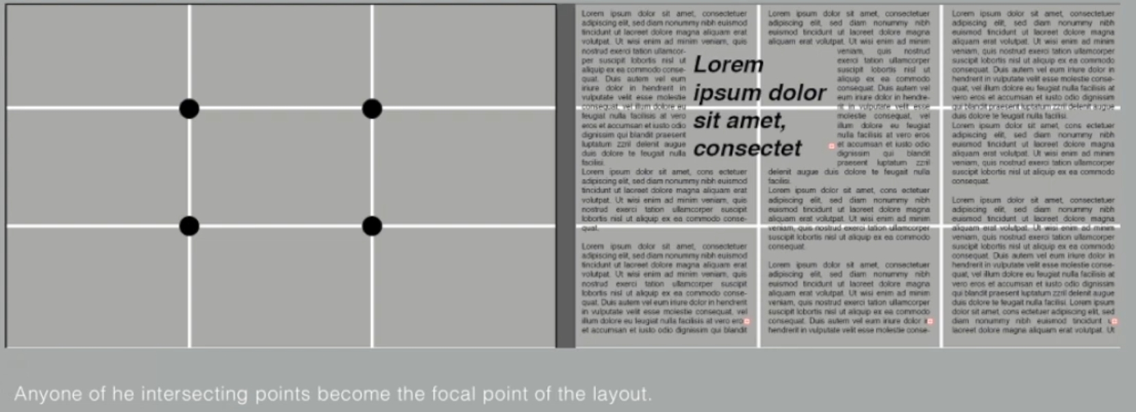
The Rule of Thirds is a photographic quide to composition, it basicallysuggest that a frame (space) can be divided into 3 columns and 3rows. The intersecting lines are are used as guide to place the pointsof interest, within the given space.

Realistically no one would ever use the rule of thirds when there areother more favorable options.
3. Typographic Systems
These 8 systems we have covered in depth in theory and practicalFrom the 8 systems the most pragmatic and the most used system is the Grid System (or Raster Systeme), which is derived from thegrided compositional structure of Letter Press printing.
It was further enhanced by what is now come to be termed as theSwiss (Modernist) style of Typography, with its foremost proponentsbeing Josef Muller Brockmann, Jan Tschichold, Max Bill and such.

In reaction to this very ordered approach to Typography of themodernist era, a group of younger designers began to question andchallenge this notion of order. Thus was born the post-modernist erain Typographical systems where chaos, randomness and asymmetrywere explored. Legibility and readability were relegated to the backseat however the bests examples seem to combine the twoseamlessly.lts proponents include: David Carson, Paula Scher.Jonathan Barnbrook, to name a few.
There was a method to their madness. Order was replaced withapparent chaos but this chaos was exciting and 'new' for ageneration that was being exposed to Punk anti-establishmentthought and music. As such the asymmetry, random, repetition.dilatational and radial systems began to take root in the lexicon ofdesigner.

4.Other models / Systems
- Environmental Grid
It is an interesting manner of exploration and provides context to theforms developed in the designs-context why? Due to the fact that the system/structures were developed around key features of anenvironment associated to the communicators of the message.

- Form and Movement
This system is based on the exploration of an existing Grid Systems. Mr. VINOD NAIR developed this system to get students to explore; the multitude ofoptions the grid offer; to dispel the seriousness surrounding theapplication of the grid system; and to see the turning of pages in abook as a slowed-down animation in the form that constitutes the placement of image, text and color.
The placement of a form (irrespective of what it is) on a page, overmany pages creates movement. Whether the page is paper or screenis irrelevant.


The level of complexityincreases as newerelements are introducedin a incremental fashion:addition of one colour,then image, then dummytext and so on.

*Those examples of the images above are screenshots from AdTypo_2_Typographic Composition.
Week 3
Context and Creativity
- Handwriting
Why is handwriting important in the study of type/typography?
We study handwriting because the first mechanically producedletterforms were designed to directly imitate handwriting. Handwritingwould become the basis or standard for form, spacing andconventions mechanical type would try and mimic.
The shape and line of hand drawn letterforms are influenced by thetools and materials used to make them. Sharpened bones, charcoalsticks, plant stems, brushes, feather and steel pens all contributed tothe unique characteristics of the letterform.
Additional factors included the material upon which the forms werewritten: clay,papyrus, palm leaf, animal skins (vellum andparchment)and paper.

c.3000 B.C.E
Cuneiform, the earliest systemof actual writing, was used in anumber of languages betweenthe 34C.B.C.E. through the 1stcentury C.E. lts distinctivewedge form was the result ofpressing the blunt end of a reedstylus into wet clay tablets. Thecuneiform characters evolved from pictograms.Cuneiform was written from left to right.

2613-2160 B.C.E.
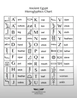
The Egyptian writing system isfused with the art of reliefcarving.The system was amixture of both rebus andphonetic characters-the firstlink to a future alphabeticsystem.Hieroglyphic imageshave the potential to be used inthree different ways:
The Phoenicians system thenwas adopted by the Greeks whoadded the necessary vowels. Early Greek was comprised on only capital leters, written between 2 quidelines organized them into horizontal rows.
- As ideograms, to representthe things they actually depict.
- As determinatives to show that the signs preceding aremeant as phonograms and toindicate the general idea of the word.
- As phonograms to representsounds that "spell out" individual words.

- Early Greek / 5th C. B.C.E.
The words may have been in rows but the direction of reading was not yet fixed. Greekwas often read in a format known as boustrophedon or "asthe ox plows." One row wouldread left to right and then switchfrom right to left.
These early Greek letters weredrawn freehand, not constructed with compassesand rule, and they had no serifsneither the informal entry andexit strikes left by a relaxed andfluent writer, nor the symmetrical finish stroke typically added to letters by formal scribes.
In time the strokes of theseletter grew thicker, the aperturelessened,and serifs appeared.The new forms, used for
inscriptions throughout the Greek empire, served as models for formal lettering inimperial Rome.
And those Roman inscriptionalletters-written with a flat brush,held at an angle like a broad nibpen, then carved into the stonewith mallet and chisel-haveserved in their turn as modelsfor calligraphers and typedesigners for the past twothousand years.

- Roman Uncials

- English Half Uncials, 8th C.

8C. CE
After the fall of the RomanEmpire, the end of a centraladvanced culture resulted ingeneral illiteracy and abreakdown of handwriting intodiverse regional styles. For 300years the knowledge of writingwas kept alive mainly in theremote outposts of religious cloisters and retreats.

- Carolingian Minuscule
The Carolingian minuscule, wasused for all legal and literaryworks to unify communicationbetween the various regions ofthe expanding Europeanempire.
The Carolingian minuscule was as important a development as the standard Roman capital-forit was this style that became thepattern for the Humanistic writing of the fifteenth century;this latter, in turn was the basis of our lower-case roman type.

12-15 C. CE
What is Gothic? Gothic was theculminating artistic expressionof the middle ages, occurringroughly from 1200-1500.Theterm Gothic originated with theltalians who used it to refer torude or barbaric cultures northof the ltalian Alps.
The Gothic spirit took hold in France, Germany and England where it was manifested through unhindered upward striving:the vertical supplantedhorizontals as the dominant linein architecture; the pointed archreplaced the round arch of theRomans: the almond shape, ormandorla, was preferred. Gothicwriting forms reflected this aesthetic.Blackletter is characterized by tight spacingand condensed lettering.Evenlyspaced verticals dominated the letterform.
Condensing line spacing andletter spacing reduced theamount of costly materials inbook production.

- The ltalian Renaissance
The Humanist admired theCarolingian script , which had clear open handwriting.


● Movable Type
11 C.-14 C.
Printing (wood block) hadalready been practiced inChina, Korea and Japan(Dharani Sutra, AD 750).Earliest known printed book (AD868)is the Diamond Sutra: 16scroll with the world's firstprinted illustration.
China had attempted usemovable type for printing butwas unsuccessful due in part tothe number of characters and the material used (clay).
In late 14 C.several decadesbefore the earliest printing inEurope, the Koreans establish afoundry to cast movable type inbronze-allowed thedismantling and resetting of text.
With the creation of their newscript Han'gul, the Koreans would succeed where the Chinese failed.
To conclude, the introduction ofmoveable type was introducedin the 1000-1100 CE. Thisinnovation was pioneered inChina but achieved in Korea(Diamond Sutra). In the late 1300-1399 CE,several decades before the earliest printing inEurope (Guttenberg's bible1439),the Koreans establish afoundry to cast movable type inbronze.


Why do we talk about Greek influence on Rome, but not Egyptian or Near Eastern influence on Greece?
Because in the 19th century and the rise of the modern BritishEmpire, it became out of style to credit Africa or Africans withanything of value, and therefore Greece and Rome were elevatedover much older, much more influential civilizations, specificallyAncient Egypt, but also less extensive or old civilizations likeMesopotamia, the Indus Valley, China, etc.
An example of this insidiousness is how the European academicprocess worked to create the discipline of "Indology". Max Muellerwho was central to this, never actually visited India. By viewinghistorical evidence through colonial lenses they ignorantly postulatedideas that were self serving,i.e.Aran theory.
And the same is true for: Classicism, Egyptology, Africanism, Indology and Orientalism.
- Handwriting
What is important to note is that later day typographers, throughresearch, curiosity and a respect for history would pay homage tothese developments. This would result in books being written andpublished, recreation of the hand written styles into mechanical formsfor printing.
With the digital revolution, the west would begin to digitize many of itshistorical creations and type foundries would create, market and sellor license them. The recognition of the importance of these historicalletterforms is something to be admired and learned from.
With the colonization of the east by the west, much of the heritageand cultural practices in literature, arts and crafts, langu8ages andscripts would be halted or stunted.
So let us look into eastern developments in handwriting briefly.
- Evolution of Middle Eastern Alphabets: lt is also important to notethat while the Phoenician letter marks a turning point in writtenlanguage-use of sound represented in letters-the script itselfhas been possibly influenced by the Egyptian Hieroglyphics andHieratic Scripts.

- The Evolution of the Chinese script: From the Oracle boneto Seal Script to Clerical Script, Traditional and Simplifiedscripts.


- The oldest writing found in the 'Indian' subcontinent theIndus Valley Civilization (IVC) script (3500-2000 BCE), isas yet undeciphered and seems to have been somewhatlogo-syllabic in nature."Some believe that these symhols are non-linguistic, while others argue that they represent an language."
 |
| http:/www.desianindia.net/thoughts/historv/indian-letter-type-desion |
- The Brahmi script (450-350 BCE) is the earliest writing systemdeveloped in India after the Indus script. lt is one of the mostinfluential writing systems; all modern Indian scripts and severalhundred scripts found in Southeast and East Asia are derived fromBrahmi.

- Handwriting
The oldest writing systems present inSoutheast Asia were Indian scripts. Therewere a few, but the most important wouldbe Pallava (or Pallawa in Malay), a SouthIndian script originally used for writing Sanskrit and Tamil.
Pallava was highly influential, becoming the basis for writing systems across Southeast Asia.
But Pallava wasn't the only Indian script inuse in the Malay Archipelago. Another was Pra-nagari, an early form of the Nagariscript, used in lIndia for writing Sanskrit.
But wait...


Does this mean Nusantara never had writing systems of its own?Were they all just borrowed from India?
This is where we get to what is perhaps Indonesia's most importanthistorical script: Kawi. Based on Nagari, but indigenous to Java.
The word Kawi comes from the Sanskrit term kavya meaning poet.The interesting thing about Kawi is that it was the script used forcontact with other kingdoms. Because it was so widespread, Kawibecame the basis of other scripts in both Indonesia and the Philippines.
This means that ancient kingdoms in of the Malay Peninsula would have been using both Indian scripts and Kawi to write old Malay language.
 |
| Laquna Copperplate Inscription |
- Fast forward.
Scholars have theorised the existence of an ancient Gujerati-derived Proto-Sumatran writing system which was the basis ofmedieval scriots on the island. More can be read about this here.

Jawi, the Arabic-based alphabet. We all know Jawi was introducedalong with lslam. But how this happened is more interesting than "weconverted and adopted the Arabic alphabet".
Ancient Hindu societies in both South and Southeast Asia wereclassist and often caste-based. The lower classes were generallyilliterate. Obviously lslam didn't change this completely, but it didencourage teaching for the sake of proselytization
When those traders engaged in missionary work, they would havetaught Jawi to people that might otherwise not have learned to readand write. This allowed it to spread among the upper and middle-class in the trading ports. However it took a while for Jawi to supplantother scripts, and in some areas never did so completely.

In modern Malaysia, Jawi is of greater importance because it's thescript used for all our famous works of literature. Every hikayat andMalay charm book is written in Jawi. Unlike Indonesia, we don't havea huge wealth of pre-Jawi inscriptions and writings-this part of thereason why some tend to ignorantly claim that Jawi is "tulisan asalMelayu", which is of course untrue.
Here is an article that gives a small very basic overview in what is acomplex history of writing systems in the Malay archipelago / South East Asia.
All systems of writing have some form of influence. To claim completeoriginality is inaccurate and some would say ignorant. History givesus context, but it also gives designers opportunity to design, researchor help codify to communicate and understand better our collective heritage.

- Handwriting
Why is handwriting important in the study of type/typography?
We study handwriting because the first mechanically produced letterforms were designed to directly imitate handwriting.
Handwriting would become the basis or standard that for form,spacing and conventions mechanical type would try and mimic.
For decades, Asia/East has neglected much of its written heritage,and by adapting western printing technologies (letter press, linotype.Unicode), it was difficult to create many of the old text in printed form,because it would take know-how, much time, effort and money.
However with a mild renaissance in the East, with the advent of computer programmers in large numbers, we are starting to see theproliferation of indigenous scripts on phones, tablets and computers.
2. Programmers and Type Design
More vernacular scripts are being produced by software giants(Google): in their employment a great many Asian programmers anddesigners. More and more vernacular and “multi-script" typefaces-a term coined by Muthu Nedumaran-are being produced to cater tosituations where the written matter is communicated in the vernacularscript or vernacular and Latin scripts.

3. Local Movements and Individuals
Huruf a local group of graphic designers interested in the localizedlettering of latin and vernacular letters painted or inscribed on wallsand sianages are amongst the more prominent organizationsdigitizing and revitalizing typefaces in Malaysia.
Ek Type and Indian Type Foundry are organizations that have doneground breaking work with the development of vernacular typefaces in India.
In South East Asia, the movement has not organized and coordinateditself well enough. But with increasing awareness and examples fromlarger neighbors like India with their large talent pool and resourcethe knowledge behind methods used and approaches taken are moreaccessible geographically speaking.
Creativity and originality are properties that are most oftenintertwined. It is important for young designers to look inward andexamine their histories, civilization, culture and communities to bringthese past developments into the future and develop on them insteadof blindly appropriating cultures and developments that have nocontext,relatability or relevance.
Creativity and inspiration should begin by observing our surroundingsand exploration of our collective histories.
*Those examples of the images above are screenshots from AdTypo_3 Context&Creativity.
Week 4
Designing Type
So why design another typeface? Xavier Dupré(2007)in theintroduction of his typeface Malaga suggested two reasons fordesigning a typeface:
- type design carries a social responsibility so one must continue toimprove its legibility.
- type design is a form of artistic expression.
- Adrian Frutiqer
"Adrian Frutiqer is a renowned twentieth century Swiss graphicdesigner. His forte was typeface designing and he is consideredresponsible for the advancement of typography into digitaltypography.His valued contribution to typography includes thetypefaces; Univers and Frutiger.”
Let us look at the typeface Frutiger, his name sake. Frutiger is a sansserif typeface designed by the Swiss type designer Adrian Frutiger in1968 specifically for the newly built Charles de Gaulle InternationalAirport in France. A more detailed history can be found here.
Purpose: "The goal of this new typeface was create a clean,distinctive and legible typeface that is easy to see from both close upand far away. Extremely functional."
Considerations/Limitations: letterforms neded to be recognized evenin poor light conditions or when the reader was moving quickly pastthe sian. He tested with unfocused letters to see which letterformscould still be identified.
 |
| Source:https://openlab.citytech.cuny.edu/type/2015/02/24/the-story-of-frutiger-lypeface-of-the-airpor/ |


Adrian Frutiger received manyhonors, "at the university in the"holy city of India",Varanasi, hefelt he had received the highest ofhonors, without medals orcertificates. He had designed anew Devanagari font for moderntypesetting and printing processesat the request of the Indian DesignInstitute. His goal was to simplifythe sacred characters, withoutcompromising their ancientcalligraphic expression. AsFrutiger sat waiting on the coolfloor of a high vaulted room in theuniversity, surrounded by religiousdignitaries in ceremonial regalia, agroup of "wise men" contemplatedand discussed his first draft forquite some time. Finally theyspoke of their judgment: they"approved" his draft of the newDevanagari and saw no "desecration of something thatwas,for them, sacred".
Adrian Frutiger at the NationalInstitute of Design (NlD), India 1964. Source here.

2. Matthew Carter
Matthew Carter is the son of Harry Carter, Royal Designer for Industry,contemporary British type designer and ultimate craftsman. Carter trainedas a punchcutter at Enschedé by Paul Rädisch, responsible forCrosfield's typographic program in the early 1960s, MergenthalerLinotype's house designer 1965-1981.
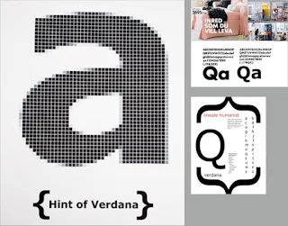
Many of Carter's fonts were created to address specific technicalchallenges, for example those posed by early computers... Let us lookat Verdana(1996) for Microsoft
Purpose: the font was tuned to be extremely legible even at very smallsizes on the screen due in part to the popularity of the internet andelectronic devices.
Considerations/limitations: The Verdana fonts exhibit characteristicsderived from the pixel rather than the pen, the brush or the chisel.Commonly confused characters, such as the lowercase i j l.
 |
| Source:https://www,myionts.compersonMatthew Carter/ https://docs.microsoft.com/en-us/typography/font-list/verdana |
Off screen, Georgia and Verdanahave also made appearances inprint. In 2010 there was a lot of"fontroversy" when it was announcedthat lKEA would be changing fromFutura to Verdana. More here.


In 1976, AT&T commissioned thedesign of a new typeface whose solepurpose would be for use in theirtelephone directories. The designhad to solve multiple technical andvisual problems related with theexisting phonebook typeface, BellGothic.The solution, named inhonour of the company's 100thanniversary, was Bell Centennial.More here.

 |
| Comparison, font vs printed |
3. Edward Johnston
Edward Johnston is the creator of the hugely influential London"Underground" typeface, which would later come to be knows as"Johnston Sans"(1916).
He was asked to create a typeface with “bold simplicity" that was trulymodern yet rooted in tradition. Johnston's design, completed in 1916,combined classical Roman proportions with humanist warmth.
Purpose: London's Underground railway ordered a new typeface for itsposters and signage from the calligrapher Edward Johnston. He handedover details and examples of letter shapes that would set the tone forprinted text until the present day.
Consideration/limitation: "Johnston's remit was to unite the LondonUnderground Group, the different companies all using the same rails andtunnels," "All the advertising, all the signage was all completely different .there was this cacophony of letters. Johnston applied the proportions ofRoman capital letters to his typeface, so it was rooted in history, rooted intraditional calligraphy. But it has an elegance and a simplicity thatabsolutely fitted the modern age."
 |
| Source:https://www.thequardian.com/artanddesiqn/2016/mar/10/edward-iohnston-london-underqround.typeface-100-years-ditchling:sussex-eric-oill https://www.bbc.com/news/magazine-35916807 |


Top: His former student was perhapsdriven by the guilt of seeing thesuccess of his own typeface, Gil Sans, which he admitted had beenheavily based on Johnston's work.
“I hope you realise that I take everyopportunity of proclaiming the factthat what the Monotype people callGill Sans owes all its goodness toyour Underground letter," Eric Gill.


- General Process of Type Design
- Research
When creating type, we should understand type history, type anatomyand type conventions. We should also know terminologies, side-bearing,metrics, hinting...It is then important to determine the type's purpose or what it wouldbe used for, what different applications it will be used in such aswhether the typeface is for school busses or airport signages, etc.We should also examine existing fonts that are presently being usedfor inspiration/ideas/reference/context/usage pattern/etc.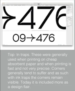
- Sketching
Some designers sketch their typeface using the traditional tool set(brushes/ pens, ink and paper) then scan them for the purpose ofdigitization. They are more confident with their hands and have bettercontrol using it.Some designers sketch their typeface using digital tool sets, such asWacom directly into a font design software (much quicker, persistent.and consistent) but this can sometimes impede the natural movementof hand strokes.Both methods have their positives and negatives.
- Digitization
There are professional software that are used in the digitization oftypefaces, amongst the leading software are: FontLab and Glyphs App.There are designers that also use Adobe lllustrator to design or craftthe letterforms and then introduce it into the specialized font apps.This however is frowned upon by the purist.Attention should not only be given to the whole form at this stage butalso to the counter form. The readability of the typeface is heavilydependent on it.
- Testing
Testing is an important component in the design thinking processThe results of the testing is part of the process of refining andcorrecting aspects of the typeface. Prototyping is also part of thetesting process and leads to important feedback.Depending on the typeface category(display type/text typ) thereadability and legibility of the the typeface becomes an importantconsideration.However it is not as crucial if the typeface is a displaytype, where expression of the form takes a little more precedence.
- Deploy
Even after deploying a completed typeface there are always teethingproblems that did not come to the fore during the prototyping andtesting phases. Thus, the task of revision doesn't end upondeployment.The rigour of the testing is important in so that the teething issueremain minor.


- Typeface Construction
- Roman Capital: The grid consists of a square, and inside it a circlethat just touches the lines of the square in four places. Within thesquare, there is also a rectangle. This rectangle is three quarters thesize of the square and is positioned in the centre of the square. More here and here.Thus, using grids (with circular forms) can facilitate the constructionof a letterforms and is a possible method to build/create/designyour letterform.

- Construction and considerations: Classification according to formand construction
Depending on their form andconstruction, the 26 characters of thealphabet can be arranged intogroups, whereby a distinction ismade between a group for thecapitals and a group for lowercaseletters. More here.
Many different forms and constructions must be taken into accountwhen designing a new type. An important visual correction is theextrusion of curved (and protruding) forms past the baseline and capline. This also applies to vertical alignment between curved andstraight forms.A visual correction is also needed for the distance between letters. ltis not possible to simply place letters next to each other with equalspacing between them. The letters must be altered to a uniformvisual'white space. This means that the white space between theletters should appear the same. This is called 'fitting' the type.The consideration when creating a typeface cannot be covered in itsentirety in a single lecture or in a couple of slides. As such l wouldurge you to read more about it, when time permits or when the needarises here.
However take note that there are many approaches andconsiderations other than what has been provided in the link.


Most typefaces come about due to a need or demand. Theneed/motivation can be intrinsic and extrinsic.
Intrinsic can be best summed up this way, the designer has aninexplicable need driven by interest to design a typeface, and seeksout a form that comes close to fulfilling a desire. lt is also possiblethat the designer identifies a gap/problem and thus endeavors tosolve it through the design of the typeface.
Extrinsic can be summed up in this way the designer has beencommissioned or the student-desiner has a task to complete thatinvolves designing a typeface.
For a design to be successful the desiqner needs to be invested inthe idea and understand the requirement/limitations/use/stakeholder.
Designing a typeface is a labour of love. Only the brave and foolishwalk this path for the reward pale in comparison to the work.
*Those examples of the images above are screenshots from AdTypo_4_Designing Type.
INSTRUCTIONS
<iframe src="https://drive.google.com/file/d/1mC-q_dkXaQsaHTiRAMz-IvYZH5LbKcy0/preview" width="640" height="480" allow="autoplay"></iframe>
EXERCISE 1
First of all, I followed InDesign Formatting & AdTypo_Ex_TypographicSystems_Modular and made two designs in a daze.


Of course, what is different from the videos is that the text content that needs to be typeset is as follows↓.
 |
| The part in the red box is the text content that needs to be typeset. |
So I made several ↓ drafts of the Axial System according to InDesign Formatting.


Then these ↓ are the drafts of Radial System.


Then the following ↓ are the drafts of the Dilational System.


Then the following ↓ are the drafts of Random System.


Then the following ↓ are the drafts of Grid System.


Then the following ↓ are the drafts of Transitional System.


Finally, these ↓ are the drafts of the Bilateral System.


Final Submission:
- JPEG @300 ppi (1024 px)
 |
| Axial System |
 |
| Radial System |
 |
| Dilatational System |
 |
| Random System |
 |
| Grid System |
 |
| Transitional System |
 |
| Modular System |
 |
| Bilateral System |
- PDF with guides
- PDF without guides
EXERCISE 2
In fact, this exercise has already started since the second week, but I was still doing Exercise 1 at that time.
Then I started doing this exercise in the third week. I saw the instructions given by Mr. VINOD NAIR in the advanced typography module of Microsoft Teams as follows : ↓.

Then the example is like this ↓.

To be honest, on the one hand, I hadn’t finished Exercise 1 yet, and on the other hand, I didn’t understand what to do. Until the third week of class, I referred to the works designed by other students on the one hand and Mr. VINOD NAIR’s examples ↓ on the other...
And this sentence ↓ I saw on the MIB_GCD61004_AD_TYPOGRAPHY_BDCM_2024.

"Art comes from life". So every day after class in the third week of class (2024.05.06), I used my phone to take pictures related to "tables and chairs" as materials.


So when designing the fonts, I used the following three ↓ pictures I took in school as sources.


Then after performing the "Image Tracing → Black and White Logo" operation in Adobe Illustrator, it became like this↓.


So these ↓ are ?the Submission?s for week 3?

However, there is no time for me to confirm this, because the next task that comes is to design a poster using the glyphs I built.

and then the example is like this ↓.

Then I used this ↓ picture as the background of the poster.
 |
| The photo taken in the LT13 classroom after the end of the social innovation project course on May 10, 2024 |

So the following ↓ processes are the process of design including export.


These four ↑ are the posters that I finally think can be exported. As for which one to use, I plan to decide which one to export after Mr. VINOD NAIR gives feedback in the 4th week of the course.
Because Mr. VINOD NAIR asked me to use the font source picture of this design as the background of this mission poster, I simply changed my idea.
Since my source of inspiration is "chair", so why don't I just use the word "CHAIR"? Just get started, I first used the two chair bars on the chair in the picture as the letter "H".


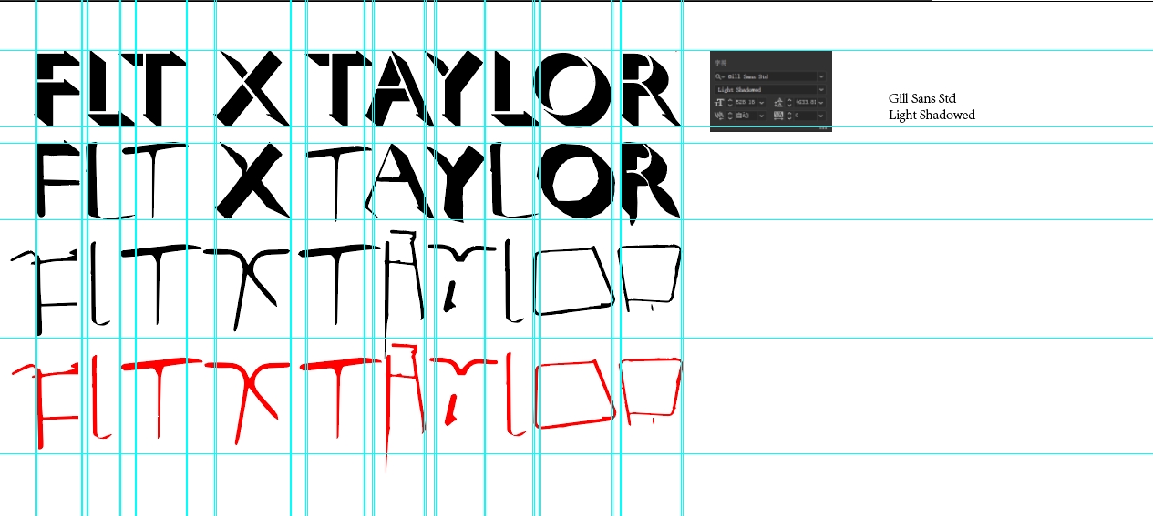
Next, I re-extracted and designed new fonts. The reference font family for this adjustment is still Gill Sans Std, but the font style has been changed to Light.


Then put the redesigned font into Adobe Photoshop.
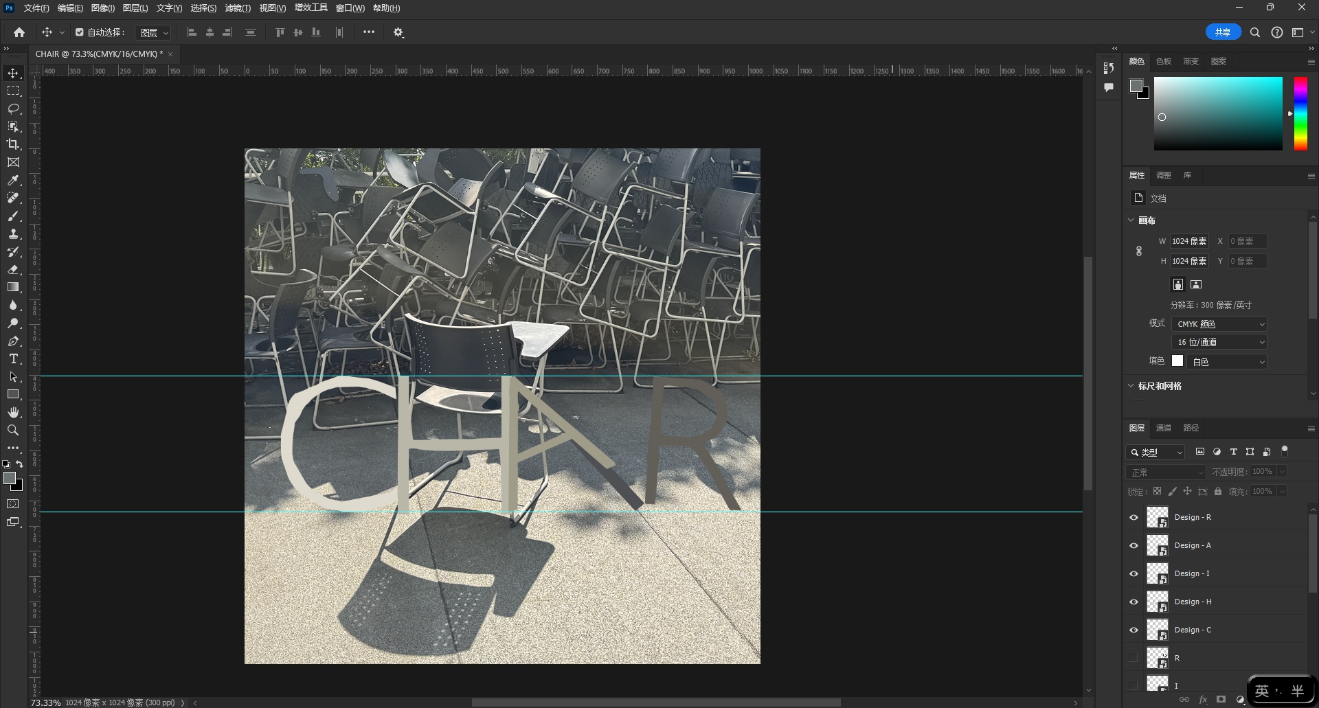
Export after adjusting the position↓.


Final Submission:
- lmage + Extraction:
 |
| Image |
 |
| Image + Extraction |
- Reference Type:Gill Sans Std(Light)

- Entire process from extraction to reference to refinement in one image

- initial extraction + final refinement


- Poster:JPEG @300 ppi (1024px X 1024px)


- Finding type items for submission
FEEDBACK
Week 1 (22/04/2024):
General feedback:
Because Mr. VINOD NAIR released the tasks for week 0 in Microsoft Teams, there was no feedback. The first week of class only introduced the contents of the MIB files in Microsoft Teams.
Specific feedback:
[E-portfolio] Follow the instructions to create an e-portfolio of the Advanced Typesetting module.
Week 2 (29/04/2024):
General feedback:
Because I did not complete all the 8 typography system exercises in the first week (only part of them were completed at that time), I did not go to Mr. VINOD NAIR for feedback, but my classmates and I confirmed the exercise content with him how many colors can only be used in it, and the instructions in the MIB file that he asked us to install in Microsoft Teams to confirm and complete our work.
Specific feedback:
[Exercise] Follow the instructions to complete Exercise 1.
Week 3 (06/05/2024):
General feedback:
This week's lecture is simply the most tiring one I have ever written. Not only because this lecture is the longest, but also because the lens of Mr. VINOD NAIR in the video blocks the text, so I can only Supplement the blocked text by guessing and referring to lectures written by others.
Specific feedback:
[Exercise] Complete Exercise 1 and 2; rework, refine, review, re-look,re-do whatever is neededin the two exercise and complete it before week 4's class.Update and complete your Task 1 Exercises: lecture, (process & final), feedback, reflection & further reading before week 4's class.
Week 4 (13/05/2024):
General feedback:
Mr. VINOD NAIR asked me to use the source of the fonts I designed as the background for the poster design for this mission.
Specific feedback:
[Perfection and preparation] Update and end task 1, then prepare for task 2.
REFLECTION
Experience
First, we will learn the basics of different existing typography systems and complete exercises to further understand their applications in typography. While working with these systems can be a little challenging at first, it's also exciting to use my creativity to design layouts based on each system. Secondly, we need to modify our layout based on Mr. Vinod's feedback, which helps me improve the overall layout. Additionally, we were asked to extract letter forms from images according to the guidelines stated in MIB_GCD61004_AD_TYPOGRAPHY_BDCM_2024, which was a very interesting exercise and allowed me to explore different forms of letters that can be extracted from images.
Observation
One of the random systems is challenging because of its disordered nature. Through my observations and further reading, I enhanced my understanding of typography systems. I'm not very familiar with the Transitional system, which makes me wonder about its use in layouts. Additionally, the exercises in Type & Play allowed me, as a junior designer, to learn more about typography by creating letter forms from nature.
Findings
First of all, I found that the typography systems I knew were limited to traditional grid systems, but I was able to apply the knowledge I learned to these systems to create more colorful layouts. Secondly, I realized that my knowledge and understanding of typography systems had grown to ensure that each system was being used correctly. Additionally, I realized that I could create unique letter shapes by extracting letter forms from various images such as nature.
FUTHER READING
1. Typographic Systems
 | |
| "Typographic Systems" by Kimberly Elam | |
Elam K. (2007), “Typographic System” by Kimberly Elam, Princeton Architectural Press
Week 1 / 2024.04.22
An introduction to typography systems with clear definitions and images to understand the basics of each system within the typography system.
Week 2 / 2024.04.29
The remaining chapters of the book further explain clearer definitions through various layout examples from past designers, giving me a solid understanding of each typesetting system and its application in layout. Additionally, I was able to gain insight into how simple elements such as the shape, transparency, or weight of text can be used to enhance individual layouts.
2. Finding Type: A Novel Typographic Exercise
 |
| "Finding Type: A Novel Typographic Exercise" by Vinod Nair |
Nair V. (August 6, 2023), Finding Type: A Novel Typographic Exercise, Kreatif Beats
Week 3 / 2024.05.06
Typing and game-based exercises are designed to enhance students' skills and knowledge in the field of typography. This exercise consists of several stages, namely: selecting an image, analyzing the image structure, identifying letter shapes, extracting letter patterns, comparing with reference materials, and optimizing the letter design. Through these steps, students will learn how to maintain consistency in letter size and contrast, filter when retaining or eliminating specific features, and identify areas that need simplification in the process of refining letter forms.


Comments
Post a Comment