Type Design and Communication/Typography Task 3/YANG HANWEN 0364085
ID name YANG HANWEN
ID number 0364085
Program name bachelor of design (honors) in creative media
Task 3
LIST
LECTURES
Week 7 / Typos Task 3A Font Structure (Shape)
Week 8 / Typo Task 3A Typeface Constructions (Shapes)
- Create baseline, riser, x-height, and descender lines
- Start combining your letter forms, making sure the anchor points are not too close to each other
- Import glyphs into FontLab
- Create new font file and name your font
- Metrics and dimensions used to populate key heights etc.
- Underline should be below descending order
- Once done, import the letters into the cells
- Some areas may be missing by default - click on the small icon in the upper right corner
- Rescale all bars to 0 and slowly adjust from there to the desired amount = kerning
- Save the file, go to file and generate the font
INSIRUCTIONS
<iframe
src="https://drive.google.com/file/d/17I0HL7XC2EYSEa9KrTMYveVGPU2BZBDf/preview"
width="640" height="480" allow="autoplay"></iframe>
EXERCISES
Week 7: 2023.11.06
- Deconstructing letter forms
In week 7 ,I needed to deconstruct and study the uppercase and
lowercase letter forms h, o, j, b in order to understand how each
letter is formed and put myself in the shoes of a type designer. I
need to select 1 font from the given 10 fonts to deconstruct.
Font: ITC New Baskerville Std Roman

|
|
Anatomy of the lowercase letter “b” |

|
| Anatomy of the Capital Letter "J" |
The above is my dissection of the capital "J" ITC Baskerville's Std Roman, I understand that the arms of the capital "J" are not a straight line but still curve inwards.

|
| Anatomy of the Capital Letter "O" |
|
|
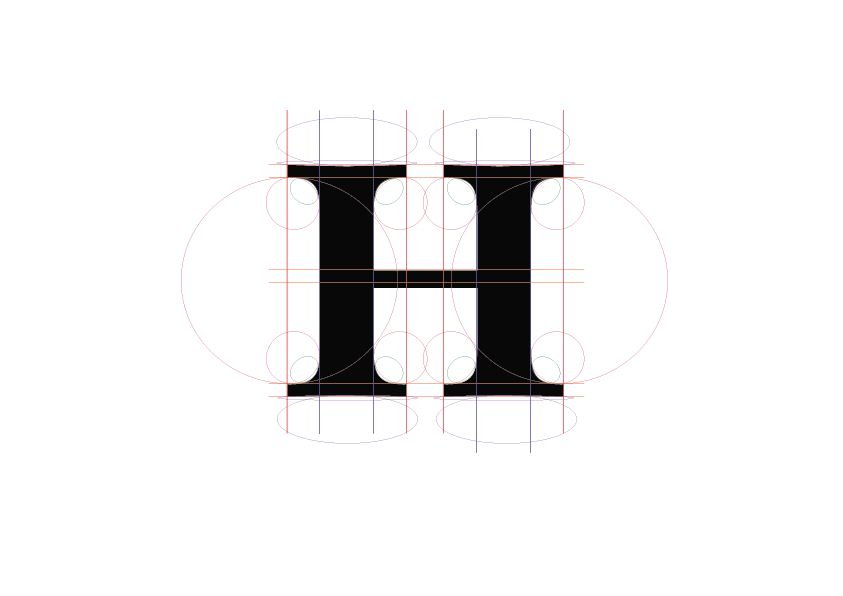
Anatomy of the Capital Letter "H" |
Week 8: 2023.11.17
Pens/Tools used :
- 3.0 RED
- 3.0 BLACK
- 3.0 BLUE


Week 9: 2023.11.20
Rewritten:


Week 10: 2023.11.27


Approved:


|
| Not approved |


Rewritten:


Digitizing:


Week 11: 2023.12.04
Final Digitizing:
FontLab test:


Week 11: 2023.12.11


FINAL Task 3: Type Design & Communication
Download font here:https://drive.google.com/file/d/1_9PM_8xRj71WWspj3haLTLA4sGdfAQ1n/view?usp=sharing
 |
| The Font |

|
| FontLab Screengrab |

|
Type Design & Communication.jpeg |

|
| Final poster.jpeg |
Final poster.pdf
FEEDBACK
Week13 (18/12/23)
General Feedback:
The teacher checked my blog and the poster I designed. Although I actually forgot to save the project file after finishing the poster, I still quickly completed the progress of the poster I completed after class last week in class. The teacher used my computer adjusted the position and angle of each word in Adobe Illustrator and found that after the adjustment, it was not as good as the original version. In the end, the teacher adopted the version I finally submitted.
Specific Feedback:
[Eportfolio] The eportfolio is poorly formatted (white patches),try to correct it (although I don't know what causes these white spots).
General Feedback:
On Monday this week, my classmate invited me to go to the school’s D7.04 Mac Lab.Because the teacher stated in the W11 instructions in Teams that we would eventually need to go to D7.04 Mac Lab to make the final font on a computer with FontLab installed, so she asked me to go there. Then this Tuesday, the teacher updated the instructions in Teams and required us to do this. Finished task 3 this week. Even though Monday of this week is a holiday, I still didn’t have time to finish what I could do.
Specific Feedback:
[Poster]Use the fonts exported by FontLab to make an A4 size poster according to the instructions, and export the corresponding format according to the instructions and put it in the blog of Task 3, and finally submit it to the teacher for review.
Week11 (04/12/23)
General Feedback:
This week, the teacher checked my digital letters and said that my glyph design was too square and needed to be adjusted (should this be what it meant? My English listening is not very good). Then I sat in my seat and was stunned for a while, but fortunately this At that time, the teacher came over and personally used my Macbook to make modifications and adjustments in my Adobe Illustrator project. I finally watched the teacher's operation and understood what the teacher meant. Then in the 11th week, we need to download the FontLab 7 application to design and generate our I watched the video tutorial and made the font, but I'm not sure about the final effect. Maybe I won't know the answer until the 12th week of class (even though we have a holiday on Monday of the 12th week, our teacher is very enthusiastic to give us Prepared an online class).
Specific Feedback:
[FontLab]Test and use the FontLab 7 trial version to prepare for the full version project in D7.04 Mac Lab.
Week10 (27/11/23)
General Feedback:
This week I brought pens and graph paper to class. The teacher asked me how my digital work was going. I said, "Teacher, you asked me to draw Roman capital letters on the graph paper again, and you don't need your approval." Can it be digitized?" Then the teacher asked me to follow the instructions in Teams and tutored me individually. He pointed out to me that it was capital letters and the angle could not be changed. At this time, I finally understood that I had made a mistake in drawing in that aspect. This week, I was also It has been approved for digitization and this week is a buffer period given by the teacher for us to improve our blog.
Specific Feedback:
[Digitizing]Obtain approval and complete digitization. The first digitization is done by tracing the approved picture. The second digitization is done based on the tutorial sent by the teacher.
Week 9 (20/11/23)
General Feedback:
This week, the teacher sent an email to each of us, and then talked about a lot of things, but I didn’t actually understand what they meant. Then the email I received seemed to ask me to complete my T1 and follow-up as soon as possible. T2, but my classmate said that the teacher means that even if we make up for it, the teacher will not check it. But to be honest, maybe because of my personal conscience, I feel that even if I don’t check it, I can still make up for it. After a while, I still improved my Task1 and Task2 blogs. Finally, the teacher said something that woke me up: "Once the direction is right, the rest cannot be wrong; if the direction is wrong, no matter what you do in a hurry, it will be the same." It’s useless work. So it’s important to find the right direction, don’t rush.”
Specific Feedback:
[Letters]Rewrite it and upload it to the blog. As for whether it passes the test, you have to wait until the teacher checks it in the 10th week of class.
General Feedback:
I wrote these letters with red, black and blue markers and then went to the printing shop to scan them. I don’t know why the staff there scanned them like this for me (the top three pictures), so I took pictures with my mobile phone and then Uploaded three pictures (thebottom three pictures).
Specific Feedback:
[Letters]Then the next week (that is, during the 9th week of class), the teacher checked the fonts I drew and said that my calligraphy was too big. Then he showed me an example and asked me to draw again. The pen could not be changed, but unfortunately, At that time, I only brought a black marker, and I didn’t bring a pen or graph paper, so I borrowed the paper from my classmate at the same table, and someone else lent me a pen and gave me two more pens. After I got a new pen, I started to draw again, but the teacher said that the drawing was still wrong. Finally, when class was over, I finally asked the teacher, and the teacher said that what I needed to draw was "Roman capital font".
REFLECTIONS
Experience
In week 7, we were instructed to write fonts which was a
challenge for us as there were many creative fonts designed by
typographers. Before designing, I was actually very confused,
and I didn’t notice it in every letter. Therefore, I need to be
very careful when designing the font to avoid similarities with
other existing fonts.
Observations
It has been observed that there are many existing fonts in this
modern era, but they differ in every detail, be it their stroke
thickness, serif length, straight or curved. By deconstructing
the letter forms, it should help me understand the details of
each letter, and it should also help me with lettering.
Findings
What I discovered in Task 3 were details we often don’t even
notice when working with fonts. Often, we see fonts or words
everywhere, but we never notice how each stroke in a letter
differs in weight, length, straightness, or curvature.
FURTHER READING
"Basics of Computer Typesetting"

|
| "Computer Typography Basics" by D. Creamer |
Reference :
D. Creamer (2003), Computer Typography Basics,
I.D.E.A.S
Following choice of book is the Computer Typography
Basics by D. Creamer from the list of further
reading books provided
Week 7 2023.11.06
Fundamentals of Computer Typesetting by D. Creamer is a
book that teaches the basics of typography, including its
rules, terminology, and distinguishing between typefaces
and typefaces. It focuses primarily on general rules of
text formatting and typography. It allows me to better
understand the dos and don’ts in typography, thereby
creating better and more correct methods when using fonts,
formatting text, etc.
"Vignelli Canon"

|
| "The Vignelli Canon" by Massimo Vignelli |
Reference :
M. Vignelli (2010), The Vignelli Canon, Lars Müller
Publishers
The next book chosen is The Vignelli Canon by Massimo
Vignelli.
Week 8 2023.11.17
Since this book is a guide for novice typists, it also
details the basics you need to learn. In this chapter,
your design needs to be guided by three concepts:
meaning, syntax which we describe first, and pragmatic
concepts. Semantics is what you need to design; correct
use of grammar; overall structure; diagrams, fonts, text
and titles; illustrations and practical work to achieve
design consistency; and an end result that is completely
understandable. Involves starting point/understanding.
Assumptions and every design stage. Clarity (or lack
thereof). All you can learn from this book are the basic
principles of typography that you should apply as a
typist. This is a fun book that I enjoyed because it
simplifies the basics of typography and makes
interesting comparisons that are often relevant. The
author of this book is very firm in his views and
strongly expresses his views on typography. Overall,
this book was very insightful for me, a beginner in
typography.

|
| "Typography Referenced" by A. Haley et al. |
Reference :
A. Haley et al. (2012), Typography Referenced, Rockport
Publishers
The next book I chose for further reading was Typography
Referenced by A. Haley et al.
Week 9 2023.11.20
Chapter 1 - Type History and Timeline
Through clear and detailed explanations, this book
guides readers into the history and timeline of
typeface development, making it easier to understand.
At the same time, the book also introduces many type
designers and non-type designers who have influenced
the history of typography.
Week 10 2023.11.27
Chapter 2 - Type Design and DevelopmentBefore learning about type design, the next chapter focuses on the basic elements of letter form, such as height, weight, etc. Although this book explores the basic concepts of typography in detail, it is presented in a concise and easy-to-understand manner that gave me a deeper understanding of typography. This section not only introduces basic terminology in typography, but also highlights some suggestions that should be followed and avoided during the typography process.
Chapter 3 - Type Classification and Identification
Text can be divided into three basic categories:
serif, sans serif and script. This chapter focuses on
various classifications in typography, such as Bodoni,
Baskerville, and Bembo, identifying each category with
concise and straightforward explanations.
Chapter 4 - Typographic Principles
This section emphasizes the key role of typographic
principles in a designer's creative work and aims to
expand the designer's "toolbox" to enable them to apply
appropriate knowledge and skills in various situations to
make informed decisions about when, where and How to use
them. This chapter goes beyond mere words to avoid leaving
readers like me with the need to imagine themselves by
stating the basic principles of design for beginners and
providing example images of the corresponding
principles."Just My Type : A Book About Fonts"
 |
| "Just My Type : A Book About Fonts" by Simon Garfield |
Reference :
S. Garfield (2010), Just My Type : A Book About Fonts, Profile Books
Next choice of book : "Just My Type : A Book About Fonts" by Simon Garfield
Week 12 2023.12.11
Chapter 1 - We don't serve your type
In this section, the author explores the abundance of available typefaces, yet our preference often leans towards a limited selection such as Times New Roman and Helvetica. The question arises: what roles do the remaining typefaces fulfill? Delving into the chapter, there is a discussion on the history of Comic Sans—how and why it was created, and its journey to becoming a widely criticized font. Despite the negative comments it receives, the chapter concludes by emphasizing that, regardless of public opinion, Comic Sans remains a popular choice due to the comfort and familiarity it provides. The chapter quotes, "If you adore Comic Sans, your knowledge of Typography is limited. If you despise it, your understanding of Typography is equally limited." To sum up the chapter, it closes with a humorous note—a joke involving Comic Sans walking into a bar and the bartender remarking, "We don't serve your type."


Comments
Post a Comment