Exercise/Typography Task 1/YANG HANWEN 0364085
ID name YANG HANWEN
ID number 0364085
Program name bachelor of design (honors) in creative media
Task 1
LIST
LECTURES
Lecture 1
Introduce
Typography is a fundamental aspect of any design study. This involves creating a set of fonts. The art and skill of arranging fonts so that the written word displayed is clear, readable, and attractive.
Printing has evolved over more than 500 years, from calligraphy to lettering to typography. Calligraphy refers to the method of writing, while lettering refers to the process of writing letters. Typography uses many terms, conventions, and unspoken rules (of your own judgment) based on stylistic trends and influences. Typography is how we express ourselves, convey our messages, and communicate effectively. Anyone can practice organizing words, letters, numbers, and symbols for publication, presentation, or distribution. Before the digital age, typography was a specialized field. The digital age has allowed more people to enter the field, leading to a decline in print quality.
The key terms are font and typeface. Typography refers to individual weights within a font, whereas typography refers to an entire family of fonts/weights that share the same characteristics/style.
Early alphabetic development (Phoenician to Roman)
The device used has a big impact on the type of text. They used these tools to scrape wet clay and chisel into stone. The shape of the capital letters is a simple combination of straight lines and circles.
Later, the Greeks changed the writing, reading, and direction of the letters from left to right, and from right to left. You have to know how to read from left to right and vice versa.
Etruscan and Roman sculptors would paint letters on marble before carving, so they used paintbrushes to repaint the stone. This happened because stones were very expensive at the time and it was impossible to write directly on them. So, before making the stone, they painted it with a brush.
Manuscripts from the 3rd to the 10th century

Square or capital letters are often used for documents that have certain desired characteristics. However, everyday actions are often skewed and simplified for speed. Here you can see the beginning of what is called a line format. Small letters are the result of writing capital letters quickly.
- dictionary = terminology

|
| Wright Form Terminology |

|
| strokes of letters |
- Many parts and names of letter forms

|
|
apex/vertex in alphabetical form |
- apex - top
- vertex - bottom

|
| Ascenders of a letterform |
5. barb - half-serif finish on curved strokes
12. descender - anything projected below baseline; lowercase letters
- em - a gap between 2 words; space bar = em space + indicator that shows an em space; also indicates an M dash/long dash = width of M
- en - space that is half the letter of M, ex. 1989 **-**1999
16. leg - short strokes off the stem → bottom (L) / inclined downward (K, R)
17. ligature - formed by combination of >2 letterforms ex. fl, fi → joined together
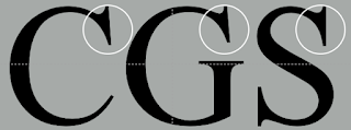
19. serif - right-angled/oblique foot at the end of the stroke
20. shoulder - curved stroke, not part of a bowl (h, n - curves connecting to vertical line)
21. spine - curved stem of “s”
22. spur - extension that articulates the junction of curved and rectilinear stroke
24. stress - orientation of letterform indicated by thin stroke in round form
- vertical stress - transition typeface (transition from copying handwritten writing; developed by mimicking writing), departure due to baskerville’s invention - creating letters that does not need to be copied anymore
26. tail - curved diagonal stroke at the finish (Q)
27. terminal self-contained finish of stroke without a serif → flat (”T” above) / flared (”t” above) / grave / concave / rounded (ball) / teardrop (finial)
- full font - type family that has many typefaces
- type family - refers to family that has many different typefaces, ex. bold, regular, etc
- typeface - individual weight of that stroke
- its name comes from lead being used to compose paragraphs; consist of letters that comes from the upper case or lower case
- historically - majuscule, miniscule
- found in serifs; expert set
- certain letters sticks out from the paragraph causing a disruption in the grayscale you want to achieve
- chosen only when you have acronyms & dealing with large amount of text
- thickness of strokes changes - thinner; thinner weight / do not force command onto letters that do not originally have small capitals
- also known as lining numerals, same height as uppercase + same kerning weight
- stronger impact from numbers > delicate & sensitive numbers
- also known as old-style figures/text figures
- originally the form that numbers used to take
- seen in serif typefaces more than sans serif, x-height set with ascenders and descenders
- avoid numbers sticking out in paragraphs, hence the use of lowercase numerals
- InDesign - type - gliphs - character map - lowercase numerals
- small capitals are not in italic → only roman
- refers back to 15th century italian cursive handwriting
- miscellaneous characters changes from typeface to typeface
8. ornaments - flourishes in invitations and certificates
2. italics ; oblique
- italics - based on handwritings → 15th century italian cursive handwriting
- oblique - do not base from handwriting → roman
4. light - lighter than roman ; thin - even lighter
5. condense - roman ; compressed - extremely condense
6. extended - extended roman
Comparing Typefaces
- goal - easy readability & appropriate expression of contemporary aesthetics
- conveying message requires a type family that respects the message you are conveying/presenting
- understanding the 10 typefaces to develop your skills as a typographer
- each letters may display a range of attitude (whimsical, stately, mechanical, calligraphic, harmonious, awkward)
- differs in variety, line weight, relative stroke widths, feeling
- not symmetrical, stroke weights can be easily seen in Baskerville form
- each brackets that are attached to the diagonal stems has its own unique arcs
- reasons underpinning their differences; optical reasons
-
common mistake - giving a lot of
character and changing a lot of details
of the letter ; simplify your
characteristics & replicable to
other letters

|
| Uppercase Letter |
- size of lowercase letterforms
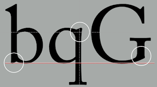
- curve strokes (s) must rise above median line / or below baseline to appear same as horizontal and vertical strokes
- curve letters exceeds median line, same size will look optically smaller (o always look smaller because it has less real estate/are and baseline; optical adjustment to compensate it)

|
| Size of lowercase letterforms |

|
|
X-height of lowercase
letterforms |
- examine in close details
- important to examine existing typefaces before designing your own letterforms to understand the convention of the letterforms/different approaches to create that typeface

|
| Details of Letterforms |

|
| Forms and Counter forms of letterforms |
- simple contrasts produces variation - small + organic/large + machined ; small + dark / large light
- dealing with different set of information, differentiating the content

|
| Contrast between Letterforms |
Different medium
- present - largely based on screen platforms due to technologies
- use of paper to communicate reduced
- edited, typeset, printed ; good typography and readability = skilled typesetters and designers
- long reading form may be preferred in e-books in comparison to physical books (still in debate)
- causes developmental effect of not being able to use touch and feel to learn among children
For example, printing affects the screen. Movie titles, beginnings, and endings exist not only on paper, but on many screens, including operating systems, system fonts, device 7 screens, and windows.
Typing from a browser can cause various layouts in how the page is displayed. Typography expertise is limited to app/web design, and pushing the boundaries of typography requires a lot of coding.
1. Print type vs Screen type
Type for print
- common typefaces used;
- ensure smooth, flowing, pleasant to read
- versatile, easy to digest; neutrality and versatility for a breeze quotation
Type for screen
-
common typeface that enhances readability and performance on
screens; caslon, garamond, baskerville
- elegant, intellectual + readability at small font size
- used to lack of clarity that are delicate (bodoni), now - good resolution on screens, important what you see on screen
- ex. taller x-height/reduced ascenders/descenders, wider letterforms, open counters, heavier thin strokes, serifs, reduce stroke contrast, modified curves & angles
- small size typefaces - more open spacing; leading and spacing on screen varies on space given and no lumping together, improves character recognition & overall readability
2. Hyperactive link/Hyperlink
- an old method to navigate document online
- word, phrase, image that jumps to a new document/section within existing document when clicked
- default - blue, underlined; arrow changes to small hand pointing when cursor is over a hyperlink
3. Font size for Screen
- text printed in books/magazine - 16pt
- read closely - 10pt
- arm length - >12pt
4. System fonts for screen/Web safe fonts
ex. open sans, lato, arial, helvetica, times new roman, times, courier new, courier, verdana, georgia, palatino, garamond
System fonts for screens
- differs in every operating system/device
Web safe fonts
- appears across all operating system

|
| System fonts for screen vs Web safe fonts |
5. Pixel differential between devices
- pc, tablets, phones, tv - differ in size, pixels size
- ex. 100 pixels laptop vs. 100pixels big 60”HDTV
6. Print type vs Screen type
7. Static vs. Motion
- more dynamic - motion /less dynamic - static
- dynamic subjects to designers
Static
- minimal & traditional characteristics
- informational, promotional, formal, aspirational - level of impression & impact left closely associated to emotional connection of viewers
- platforms - billboards to posters, magazines to fliers
- ex. bold, italics - only a fraction of expressive potential of dynamic properties
Motion
- dramatic; letterforms is fluid and kinetic
- found overlaid in music videos, advertisement - set in the motion following its rhythm of the soundtrack
- on screen typographers - expressive, establishing tone of associated content/expressing brand values
- title sequences - preparing audiences by evoking the mood for the film
- ex. film title credits, motion graphics, brand identities of film/television - consist animated types
INSIRUCTIONS
Week 3:
2023.10.14
TASK1 Exercise 02 / Text Formatting
Font/s: Chanticleer Roman NF (Regular)
Type Size/s: 72 pt
Leading: 36 pt
Paragraph spacing: 0
BODY
Font/s: Chanticleer Roman NF (Regular)
Type Size/s:11pt (text) , 18pt (caption)
Leading: 11 pt (text)
Paragraph spacing: 11 pt
Characters per-line: 45 -65characters / line
Alignment: left justified
Margins: mm top - 23mm ; mm left - 16mm ; mm right 16mm ; mm bottom 52mm
Columns: 2
Gutter: 5 mm
FEEDBACK
Week 5 (23/10/23)
General Feedback: Note that although this is the feedback from the 5th week, it is actually written by me in the 6th week because I found a problem that I don’t know what the situation is Vinod-GCD60104_TDS_202309 has been tampered with? Maybe it was the teacher or maybe other students corrected the mistake? I'm not sure, but I think since it has been changed, maybe this format is worth learning and using. If you want to know what my previous Feedback looked like, you can click on this link (Feedback before being tampered with) and view. Specific Feedback: [Poor layout] I think the only thing I need to adjust this time is the position of "ON" and the font color of the cover?
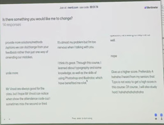
Week 4 (16/10/23) General Feedback: This week the teacher gave us a website(www.menti.com) that seemed to let us write feedback, and it was very funny. I used Chinese to translate the English through Google, then uploaded it to the text box and then submitted the result. The big screen really showed that I sent it. The text in the past.
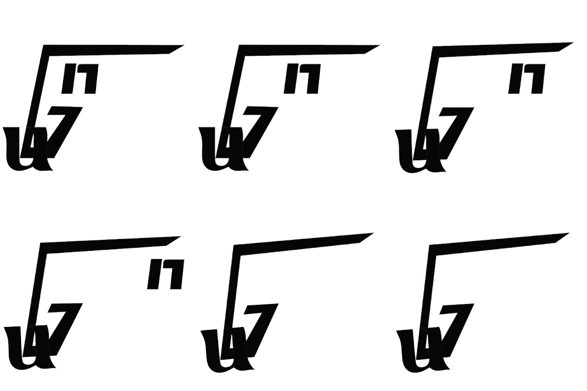
Specific Feedback: [Animation] There is nothing to modify in the animation, so we back to the topic. This week is required to write a lecture summary for the lecture "Typo_2_Basic" and record it in the task 1 electronic portfolio and complete the task 1 Ex.2.Week 3 (9/10/23) General Feedback: [E-Portfolio] This week I was late for an hour, and the teacher looked at my homework and told me that I need to use the original words to design, so I need to correct my original homework for the second week this time. [Digitalization] And then I learned about the fourth week through a local classmate. we needed to do animation, so I made it first this time. Specific Feedback: [E-Portfolio]After finding out last week that I had misunderstood the meaning and had done something wrong, I changed it to a 4-font design. [Digitalization] Fire:The font design inspiration of the first picture is that the flame tip at the top of the flame is kept together with the top of the letter. Electric:The first picture is after typing ELECTRIC and using the lightning icon to cut the text. Freeze: The picture is after I typed "FREEZE", I made the word three-dimensional and turned it into an "ice cube font". Gun:A person is you, simplified to "u", holding a gun, simplified to "G", shooting "n" bullets. [Animation] So the meaning of this animation is that you hold the gun in your hand and shoot the "n" bullet. Week 2 (2/10/23) General Feedback: [E-Portfolio] I made a mistake about the teacher who posted the tutorial, so my special feedback on Monday was included in the DPI (Digital Photography & Imaging) homework for the second day of class, because the teacher of this class also asked us to submit the blog link for the first week's homework. So I mistakenly thought that if I submitted it directly in my homework, he would see what went wrong with me. [Digitalization] I heard from my classmates that I needed to select four pictures as sketches and draw them. Then I thought it was a pattern of drawing four pictures. [Sketches] Then I drew this sketch directly in Adobe Illustrator with 4 designs. Specific Feedback: [Sketches]We uploaded our designs in the Facebook Typography (TDS) group, but unfortunately I didn’t join until after the course. Week 1 (25/9/23) General Feedback: [E-Portfolio] In the first class, Teacher Vinod taught us how to make an electronic portfolio and asked us to watch a video tutorial. He also taught us how to put files into the electronic portfolio,but it's a pity that I didn't understand it at the time.
Specific Feedback: [Sketches] I have a question , In this video, in this”4:33” step ,My page is different with ↓ this


Comments
Post a Comment