Information Design / Exercises & FLIP Topics
ID name YANG HANWEN
ID number 0364085
Program name bachelor of design (honors) in creative media
Exercises, FLIP Topics & Practical
TABLE OF CONTENTS
- Instruction
- Exercise 1: Quantify & Visualize Data
- Exercise 2: L.A.T.C.H
- FLIP Topics
- Practical
- Feedback
- Reflection
Instruction
Google slide: https://docs.google.com/presentation/d/1ezbYwqH2Z7e-BK6I5JkasnPRqF_bpct4z5E444QI-Ew/edit?usp=sharing
<iframe allow="autoplay" height="480" src="https://docs.google.com/presentation/d/1ezbYwqH2Z7e-BK6I5JkasnPRqF_bpct4z5E444QI-Ew/preview" width="640"></iframe>
Exercise 1: Quantify & Visualize Data
Week01:2024.02.06 - 2024.02.07


In the first week of class, I need to design an infographic poster
according to the requirements in the slide above.As shown in the slide, I
need to use buttons or coins or Lego bricks to create such a design.
I originally planned to use coins for the design, but found that I didn't
have enough change. It’s not worth exchanging coins for the work and my
classmate asked me to bring her some buttons, so I stopped by “MR.DIY” on my
way to the restaurant for dinner in the evening.

Therefore, I chose to do it with buttons.
Then the next day, I went to the classroom. Mr. Shamsul Hamimi Ab. Rahman
asked us to sort the A3 paper according to size or color. I first sorted it
according to size.

Then the Sir took a look at my works, showed no interest in them, and
suggested that I classify them according to size.
So I reclassified them according to size according to what the Sir said.

Then the Sir saw my work and told me to find a
visual reference before I start designing.
I looked at the button display case in the PPT and the flickering wifi
signal on the screen, and I suddenly got inspiration.

So I used buttons to classify the wifi icons by size and color and put together a draft like the following.


In Week 3, Mr. Shamsul Hamimi Ab. Rahman checked my e-portfolio
and said there were too many blank spaces and showed me a
reference.

So the image below is my final submission.
The final assembly:

Exercise 2: L.A.T.C.H
Week 02: 2024.02.13 - 2024.02.14
In the second week I need to organize a set of information (at least 4
in place/letter/time/category/hierarchy) into a visual poster that
incorporates the LATCH principle.Poster size requirement is 1240x1750
pixels or 2048x2048 pixels
The following are reference links and some examples given by
Mr.Shamsul Hamimi Ab.
-
Pokémon Pokédex: a database of statsinformation and pictures | Pokémon
Database
-
Category:Bestiary - Gamer Escape's FinalFantasy XIV(FFXIV, FF14)
wiki
-
Dinosaur| Definition, Types, Pictures, Videos& Facts|Britannica


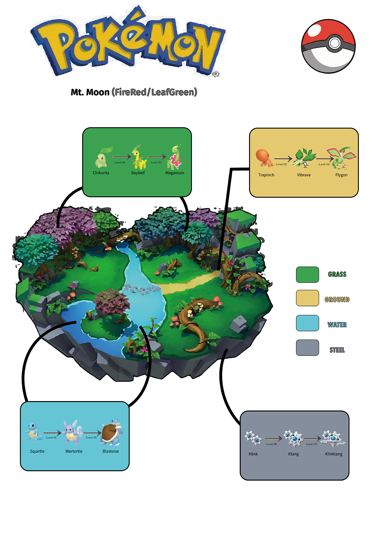
I chose the 5 factors are ↓
- Location:Mt. Moon (FireRed/LeafGreen)
- Alphabet:Pokémon
- Time: 1919.Aug.10
- Category:ELEMENTS
- Hierarchy: Pokémon Evolution

|
| Chikorita |

|
|
Trapinch |


Then I looked for picture of Pokémon-related islands

|
|
https://www.pinterest.com/pin/47147127343568026/ |

And combined with the examples in the slides, I put them one by one into
Adobe Illustrator for comparison.
As a result, I finished it without even realizing it while comparing and
referring to it.


Finally, put the completed poster into Adobe Photoshop, adjust the size to
1240 × 1750 pixels, and export it.

In Week 3, Mr. Shamsul Hamimi Ab. Rahman checked my e-portfolio and said
this poster was too poor and showed me other students’ posters for
reference.
So I made modifications in Adobe Illustrator. First, I found the attribute
icons and replaced them. The Pokmon Balls were not really needed in the
screen, so I deleted the evolved form outlines of the four Pokmon sprites
and replaced them with circles, and then curved them. The arrow indicates
that I finally changed the background color to a gradient color with four
attributes spreading around.

Finally, put the designed poster size into Adobe Photoshop, adjust it to
1240x1750 pixels and export it.


FLIP Topics
FLIP 1:Different types infographies & online tools
FLIP 2:Saul Wurman’s L.A.T.C.H
FLIP 3: Miller's Law (Chunking)
FLIP Topic 4: Manuel Lima’s 9 Directives Manifesto
Personal task:
- Redesign infographics
The picture below is an introductory diagram about the human body system
that I found on the Pinterest platform.

Then this is my inspiration or sketch for redesigning in Adobe Illustrator.


According to the instructions of Mr. Shamsul Hamimi Ab. Rahman, we
cannot use the AI tool of ChatGPT or go to Canva to copy a template,
but we can use the AI image recognition and generation function that
comes with Adobe Photoshop 2024.


Final submission:

Group tasks:
FLIP 1:Different types infographies & online tools
<iframe allow="autoplay" height="480"
src="https://docs.google.com/presentation/d/1mb4AZ1x3NHxiZHzU7QzWIepKv_tgSRJs/preview"
width="640"></iframe>
FLIP 2:Saul Wurman’s L.A.T.C.H
<iframe allow="autoplay" height="480" src="https://drive.google.com/file/d/1eIrGPXGkF9bempLQhFP2IsVT2-vImcHL/preview" width="640"></iframe>
FLIP 3: Miller's Law (Chunking)
<iframe allow="autoplay" height="480" src="https://docs.google.com/presentation/d/1OyqmQHE7SUQFc5Xw7qMppmH7Vh8_KL8X/preview" width="640"></iframe>
Practical
Feedback
Week 1 (07/02/24):
[Quantitative data]
Arrangements classified by size lacked interest, so they
were classified by color and then redesigned based on visual
references.
Week 2
(14/02/24):
[LATCH infographic poster] Use digital photo
editing/illustration software to assemble Pokemon into a
LATCH infographic poster. It is possible to reuse the image
of the monster but create other visual effects to complete
the poster.
Week 3
(21/02/24):
[Modification] Flipping the theme does not require
the Canva template. Remove the white background in the
text content. The blank space of the quantitative data
content needs to be filled. The information needs to be
more detailed and clear. The background of the LATCH
infographic poster is too monotonous and needs a gradient.
Do not use graphics but icons for classification.
Week 4 (28/02/24):
[Project 1] To redesign the poster, the picture materials need to be drawn or created by myself. Screenshots from the Internet cannot be used as materials. This project needs to be created in another information design e-portfolio.
Reflection
Creating measurable values is critical to clear data
presentation. We need to transform data and information into
visual representations. Information graphic design is mainly
used to display very complex and large information. When
designed correctly, information graphic design is a powerful
communication and presentation tool. Infographics present data
in a concise and highly visual way.


Comments
Post a Comment